Wednesday, March 16, 2022


          It seems that I have neglected this blog for awhile. I have been involved in doing illustrations for my son Dave K"s chapbook, and undertaking a rather involved restoration piece.

   This painting came to me in pieces since much of the paint and canvas were missing as well as loss of paint where the canvas was intact . At least the figures were more or less intact.I accepted this job in the summer since I had an intern interested in watching a restoration project but unfortunately by the time I had it back on the stretcher and ready to do the patching the summer was over and she was back to school- unfortunate since this would have been an interesting project to watch.            


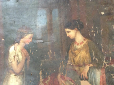
The first thing I did was reline it with a new canvas then I had to fill the the holes where the old canvas did not exist any more. There were a number of gaps and this step took me me quite a while.


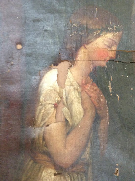
Here is an image of the left hand figure which shows all the gaps in canvas and paint.

This painting reminded me of the Pre-Raphaelite school of painting of which Dante Gabriel Rossetti. and John Everett Millais were the most prominent. They were a group of painters, poets and art critics modeled on the Nazarene movement who attempted to revive spirituality in art.  This movement started in Germany and was termed nazarene because they clothed their figures in more Biblical raiment.  They sought to return to the abundant detail, intense color and complex compositions of the early Renaissance. preferably before Raphael,

 The Pre- Raphaelites were interested in medieval art so there is a spiritual component to their works. Although this painting makes me think of this group, it is far less developed than they were in composition and execution but it retains the feel of this group.  This painting does have its figures in biblical raiment but it also has a medieval feel because they are in a chapel setting  and one is praying

I was conscious of these elements when  I was doing the pinpointing since the clothing was done with impasto but the background and figures were more smoothly painted.

I am still working on this painting since the owner brought to my attention some elements in the background that my camera did not capture. There was also so much loss of paint that it could not be seen.

I will update you on this painting as i move forward. It has been an interesting process


Thursday, May 6, 2021


    What lovely weather we are having these days but I suppose it should be expected- it's May. I have not written anything on this blog in a while and am not ready to discuss my projects as they are still in flux.

I was cleaning my office- it really needed it and I came across a paper I wrote about my art teacher who was really an inspirational and at times maddening teacher- I will recap some of it here and try to find one of her paintings to show you.

( Here is an example of one of her florals.)

My Introduction to Ann Schuler came in the fall of 1967 after I graduated from High School. We were a small enclave of full time students - 5 or 6 of us-  the rest of her students were older who came once or twice a week.

 I was thrilled with the atmosphere of Teach's studio where one learned how to mix paints and make one's pastels. Teach ( so named since there were 5 Annes and I had just tread "Up the down staircase"). Teach always had several commissions going as well as works she was restoring so it was great to see the progression of these projects. Hans, her husband, a sculptor was working on his 7 foot minute man in the middle of the studio. It was commissioned for one of the armed forces building in Washington DC

(This is a painting of her dog Rudy who was there when I was attending classes)

I found Teach's way of teaching and demonstrating of immense value and greater inspiration. It was amazing what she could do with a large brush. One of my friends, April who was a dancer was posing one time and teach was able to do a lovely portrait of her with a large brush- a quick flick and there was an eye, a dash and a flourish there and there was her mouth. She made it look so easy!

She was also a great experimenter- I remember all the different ways she tried preparing copper on which to paint. She was trying to find the manner the Dutch used- even baking it in the oven trying to get the right finish. Nevertheless, most of the experimenting went into cooking the black oil, messing with the the temperature changes as well as cooking times . 


(One of her lovely paintings of the nude)

   On one occasion it was my turn to cook the oil. Now mind you this was a time consuming process- at least 4 hours!. You had to put litharge(pure lead) into raw linseed oil and cook it over heat counting it between 210 and 220 fahrenheit, using a candy thermometer. During this time I left it to do something else- a very big no no since it was so flammable. Anyway it went above 220 and basically burnt-.Teach was really furious because she thought I had ruined it. However a week later she tried painting with it and loved it which means I had to go into detail exactly all the steps I took. The one thing about black oil is you had to wait a week for it to form a sediment at the bottom. if it did not then it was undercooked. 

Teach, for me, was a very inspiring teacher encouraging and often pushing us to strive for the perfection of the masters. Her insistence that we always study and learn , her kindness and encouragement have colored the way I approach not only my artwork but the way I teach.


Saturday, February 20, 2021

    I am feeling quite organized which is a nice feeling since it is not always the case. In my last post I talked about the use of charcoal or pencil with sanguine chalk. Today I will go through some Master drawings showing variations on the use of this technique

Here is a drawing by Francois Boucher- an artist of the Rococo period who is more well-known for his nudes. Boucher used this technique to enhance the three dimensiality of the face. If you notice most of the face is the paper color, the darkest part is charcoal and he has used the sanguine chalk to enhance the roundedness of the cheek, the lip color and some highlights in the hair. The lightest light he used white chalk. this technique when used in portraiture or the figure can show a lot of sensitivity and emotion.


On the other hand sanguine chalk can be used with great effect by itself. Note this use of the chalk in Jean-Louis Fragonard"s rendering of a landscape. Sanguine chalk, as you can see here, can offer the artist greater nuances than the pencil depending on the pressure. Some of this may be due to its color which, in my view is more pleasing than just black on white but the pencil has a tendency of being more linear and it takes a bit of concentration and thought about how hard or soft ones marks need to be. Sanguine chalk, on the other hand is much easier to create a soft effect though as you can see from this drawing it can also be precise,


Peter Paul Rubens also used this technique to great effect. It is also a way of portraying flesh without using a lot of color especially if you were doing studies for a bigger painting. Rubens frequently did drawings and even small paintings in preparation for his larger pieces.

Finally Hubert Robert, a painter of the landscape who depicted architecture, and ruins of old civilizations in his paintings. He used the sanguine chalk exclusively in his predatory drawings. Note the nuances in the darks as well as the lights.

I hope these examples may make you want to try this yourself if have not already done so. It is a lot of fun to use.


Saturday, February 13, 2021

Art materials


       It has been brought to my attention that people may be interested in the art supplies I use and why  therefore,I will begin with my favorite drawing mediums. 

I really favor charcoal and sanguine chalk when I draw.

 Nitram charcoal is my favorite brand- it is square and comes in HB, B and very soft in very large sticks. It was a french company at first but then it was bought by a canadian company. For the most part it is very consistent  and you can sharpen them to a very sharp long point. There is a sand paddle you can get that does a marvelous job of sharpening and it lasts a long time which makes it worth the price.

  Below is a drawing I did using these materials


The sanguine chalk I like to use is either creatocolor originally Hardmuth and I usually use a metal holder to use it.

I love the sanguine chalk and this brass holder is just the right thickness for me. It is, however, hard to find the narrow ones. One finds the thicker ones more often so if you do find a narrow one -just get it- since one never knows when you will see it again. Other brands I like are generals though they are harder and more like a pastel in a way.
I am not a fan of conte as I do not think it is easy to use and its texture does not suit my way of laying down marks.
Below is a drawing of my student Jessie I did a while ago and I used very little charcoal mostly sanguine and white chalk on this marvelous paper my father -in -law gave me 

i wish this paper were still available but alas it has been discontinued along with a lot of other favorite art supplies. must be Murphy's law that if you really like a surface the manufacturer will discontinue it.


I am also very fond of using the sanguine chalk/ pencil combination when I do smaller drawings


I learned this technique when I was living in France and went to see two exhibits of french drawings, which made me wantI to try it and I have never really gone back to just black and white. I feel it gives n extra dimension to the subject. One can get so many more nuances with sanguine chalk than with pencil or other black on white medium. 

It is only recently that I have found this type of drawing is called a drawing 'a trots crayons' ie. with 3 pencils- who knew.

Next time I will try to talk about some artists of the past that I admire who used this technique . So till next time

Tuesday, January 12, 2021


      It"s January and it"s pretty cold out there, so needless to say I am not painting outside although I know there are some hardy plein air painters who do. 

    Instead I have been focusing on studies of the nude and trying to make compositional  studies involving the figure in nature. Also I have been working on some gouache on an interesting board that really lends a feeling of oil. Above is the first painting I did on this board made by Davinci- its called a dual sided board.. I have been enjoying working with it.


here is a little oil done on the same board. I need to tinker with this one a little bit more but I like the effects I am getting.


As for the nude studies- I am trying some compositional things with the figure studies. Here is a pastel study of one I am now doing in oil

I basically focussed on the figure here but my oil has a rocky landscape since the figure will be spear fishing. I will post it when I am closer to finishing.

Finally over Christmas I had an interesting commission . One of my former students wanted a pastel of my studio for her future studio.


    That is all for now. I will talk to you again next time


Thursday, November 26, 2020


     I have been very excited as I have finally been able to take a Robert Liberace course on drawing the figure. Granted I could not swing the full course with critiques but I took the one with the class and auditing the critiques. It has been very exciting and inspiring to say the least. I have admired his work for some time especially his drawings which I think are exquisite and he has such a large knowledge of anatomical parts of the body. You should look him up

   I have always loved drawing the figure and got a good base at the Schuler School where I went in the late sixties early 70"s but they did not teach the figure per se. They did however give me a firm base of anatomy and schematic drawings on  which I have built ever since.

Our first couple of assignments were the torso of the male figure. here is the first one i did

Here is another and the Ecorche drawing I did of the same figure. This was a lot of fun though hard


We proceeded tp painting after that and ended up with the portrait. Below is my first attempt.We focused mostly on the torso but i would like to finish this one as i like the way it has developed. I am working on two others and a portrait that i will post later.

This has been a very satisfying experience.

Till next time

Saturday, September 26, 2020

 
 It seems like it is time for me to write another post on my blog. Although I try to be regular about it, it seems time simply flies by me. Therefore when My son Dave, who is a writer in Baltimore sends out his blog, I know its time for me to write mine. He is amazingly regular. he writes on tiny letter if you want to check him out.

Actually I have been working on a number of things: The first being a conservation of a painting for my sister.It's rather large 28 x 26 and it was supposed to be a tempera on canvas. However I discovered that it is actually an oil though it could have some tempera in there somewhere. There was a period before Van Eyck finally found the good oil paint formula when they combined the two. This painting though dirty was really full of fly feces which had to be removed by scraping gently with a scalpel-. here is an image of the painting


I also had to add a new piece of canvas to the edge and discovered the painting had been reduced so I added the piece back after consulting with my sister. I am still working on this painting so I will take another pic when it is done


My sister has a good friend Emily M who likes my work and she really liked a piece I had done several years ago and sold, so I told her I could re-do it in a different format so I did working on Uart paper rather than pastel mat ( my favorite paper) and adding some tops of buildings . I also handled the foreground darks slightly differently with a combination of purple, blue, dark brown and very dark green- no black at all.  I also wanted to get the detail of the electric wires and lights more precisely which  the Uart paper allows you to do.I liked the way it turned out

It is going to go to a friend of hers in California so I will be packing it myself before sending it off.

I also have been working on a color values workshop which happened last sunday. We worked in gouache because the mixing mimics oil painting but dries faster considering it is a water based paint. Although only a couple of students attended, i think it went well and hopefully it will impact their future paintings. here are a couple of examples of my studies for it


This is a house in Gettysburg. I did it using a limited palette of cad yellow ,orange, a carmine red, ultramarine blue, prussian blue and black. Very interesting the color mixtures one can make with just 3 of this colors. This one I used yellow orange and blue
Next time I will show you the window encased in stone and explain the mixtures I used in that one so until next time.